Design Through Glass
How Liquid Glass Changed Everything
Liquid Glass is Apple's light-reactive design material, introduced at WWDC 2025 across six operating systems. It takes the frosted, semi-transparent look of glassmorphism and elevates it with real-time refraction, reflection and adaptive transparency, glass that responds to light and motion rather than faking it with a static blur.
What Liquid Glass Actually Is
When Apple revealed Liquid Glass design at WWDC 2025, it did more than refresh a few icons, it reset the visual foundation of an entire ecosystem for the first time since iOS 7. Apple describes it as a digital “meta-material” that bends and shapes light, behaving like a lightweight liquid that responds to touch and motion.
Rather than sitting flat on the screen, controls float above content on a dynamic glass layer that reflects, refracts and scatters light the way a real glass object would and the effect even bleeds into shadow. Three principles anchor it:content always leads, geometry aligns with Apple's rounded edge-to-edge hardware, and the surface adapts its transparency in real time depending on what sits behind it. Apple's team reportedly prototyped physical glass in their studios to replicate these optics, with the clearest lineage running straight from the spatial interface of visionOS.
The 12-Year Itch: A Short Lineage
To understand why this matters, follow the arc. Early iOS leaned on skeuomorphism —notepads that looked like paper, buttons with stitched leather. iOS 7 swung hard the other way in 2013, ushering in a flat, minimalist era that dominated for over a decade. The glassmorphism design trend emerged around 2020 as are action to flat fatigue, reintroducing depth through translucency and blur —the first hint that materiality was coming back.
Liquid Glass is the next pivot. It keeps the warmth and dimensionality people missed, but grounds it in physically accurate light behaviour rather than a flat effect.It's less a new coat of paint and more a new set of physics for the interface.
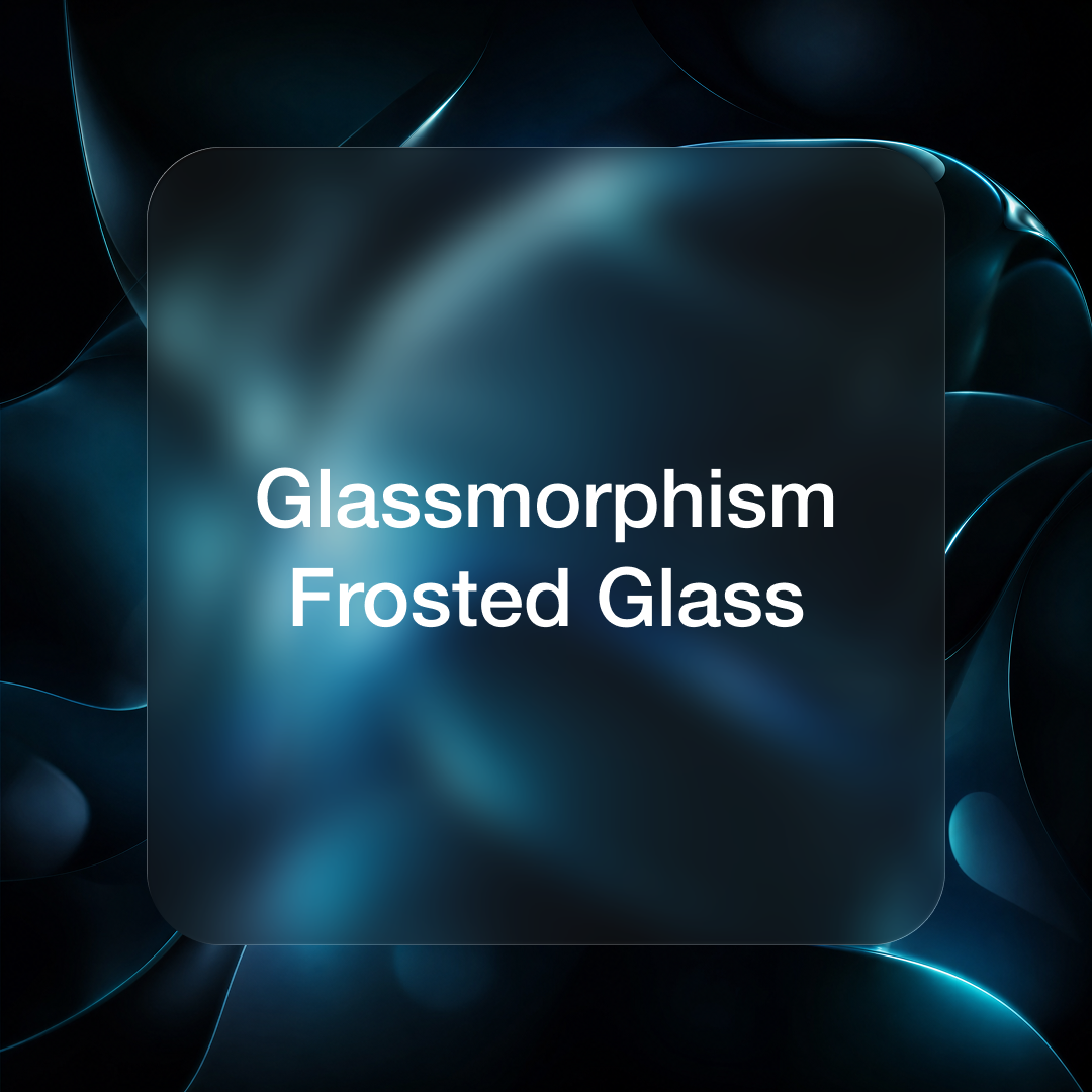
Liquid Glass vs Glassmorphism vs Frosted Glass
All three share a translucent, layered aesthetic, which is exactly why teams confuse them. The differences are real and they carry practical consequences for cost, accessibility and where each one belongs.
Glassmorphism / Frosted Glass (static)
• Simulated blur & light tint
• Fixed appearance, no real lighting
• Runs on simple CSS
• Great for web & everyday apps
Liquid Glass (dynamic)
• Real refraction & reflection
• Adapts to content & motion
• Needs GPU / silicon rendering
• Built for premium, OS-level systems
The static foundation
Frosted glass is the underlying metaphor: a semi-transparent surface that blurs whatever sits behind it. Glassmorphism is the design style built on it defined by translucency, background blur and a thin light border that mimics the edge of real glass. Crucially, it is largely static. There's no true surface lighting or reflection; a soft border glow and a light tint simulate the look, and it runs without specialised hardware. That accessibility is why it spread across macOS Big Sur, Windows 11 and Samsung's One UI.
What Liquid Glass adds
Liquid Glass takes that frosted look and makes it physically modelled. Content behind an element bends slightly (lensing and refraction) rather than just blurring. Adaptive transparency reads the background and adjusts to protect legibility. Reflection mapping adds a soft mirror-like highlight so elements feel three-dimensional, and edges blend optically instead of staying crisp. The trade-off is cost: it leans on GPU rendering to stay smooth, whereas glassmorphism is nearly free to ship.
At a glance
“Materiality with intent is back. The question isn't whether toadd glass — it's whether translucency clarifies your hierarchy or just addsnoise.”
Why Brands Should Care
Apple's designshifts ripple outward. Because iOS shapes the visual expectations of billions of users, a move this significant retrains what “modern” feels like across the whole industry, much as iOS 7 did for flat design. Teams clinging to flat, opaque cards will increasingly look dated beside interfaces that suggest depth and responsiveness. The same expectation now lands on every brand touch point, from websites to apps, and motion is a big part of why, something we unpack in Motion as aBranding Tool.
But the lesson isn't “add glass everywhere.” Liquid Glass is UX-aware: it uses subtle optical cues to signal state, focus and hierarchy, so the effect does a job rather than decorating. That judgement is exactly what belongs in a structured design process, see Tiron's UI/UX design services for how we approach material-led interfaces, and our project work for examples in practice.
It matters commercially, too. For brands in fast-moving markets like Dubai and the widerUAE, an interface that feels a generation behind quietly erodes trust before a single word is read, which is why considered branding and interface work increasingly go hand in hand.
The Tradeoffs You Can't Ignore
Authority means naming the hard parts. Both glassmorphism and Liquid Glass struggle with WCAG contrast ratios and text readability, translucent surfaces can quietly fail accessibility standards when foreground text lacks contrast against shifting backgrounds. Liquid Glass mitigates this with adaptive transparency, but designers still carry the responsibility of testing real content, not just hero mockups.
Performance is the other constraint: rich optical effects demand capable hardware, so a faithful treatment on a low-powered device or a heavy web page can degrade the very fluidity that makes it appealing. The discipline is to treat the effect asa system with rules, including a reduced-motion variant, not a filter to switch on.
Designing Through Glass
Liquid Glass marks the start of a new chapter, interfaces that blend hardware and software,2D and spatial, clarity and depth. Expect the industry to chase the look, and expect glassmorphism to remain the pragmatic, web-friendly cousin that gets most teams 80% of the way there. The brands that win won't copy the look fastest; they'll understand why the material behaves as it does. Designing through glass, in the end, is less about transparency and more about intention.
FAQ: Liquid Glass & Glassmorphism
What is Liquid Glass design?
Liquid Glass isApple's light-reactive design material, introduced at WWDC 2025 across six operating systems. It behaves like a lightweight liquid that reflects, refracts and scatters light in real time, with controls floating on a dynamic glass layer above content.
What is the difference between Liquid Glass and glassmorphism?
Glassmorphismis a largely static style that simulates frosted glass with CSS blur, a light tint and a thin border, with no true lighting. Liquid Glass models light physically, real refraction, reflection and adaptive transparency that respond to content and motion, but it needs GPU rendering, whereas glassmorphism is nearly free to ship.
Is frosted glass the same as glassmorphism?
Not quite.Frosted glass is the underlying metaphor, a semi-transparent surface that blurs whatever sits behind it. Glassmorphism is the design style built on that metaphor, defined by translucency, background blur and a thin light border that mimics the edge of real glass.
Should I use Liquid Glass or glassmorphism on my website?
For most websites, glassmorphism is the pragmatic choice: it ships in CSS, performs welland delivers the translucent look without specialised hardware. Reserve fullLiquid Glass treatments for premium, OS-level or spatial experiences, and always test contrast and a reduced-motion variant. If you want help deciding, Tiron's UI/UX design team can scope it.
References
Apple. (2025). Meet Liquid Glass —WWDC25.
DesignMonks. (2026). Liquid Glass vsGlassmorphism: The Real UX Difference.
EverydayUX. (2026). Glassmorphism in2025: How Apple's Liquid Glass is reshaping interface design.
About Me