Maximalism in Graphic Design
A Guide to Controlled Chaos
Quick answer: Maximalism in graphic design embraces bold colour, dense pattern, layered typography, and visual complexity. The style makes work impossible to ignore and opposes minimalism directly. Done well, maximalism works through controlled chaos, a deliberate hierarchy helping brands stand out in saturated digital feeds.
What is maximalism in graphic design?
Maximalism in graphic design is a visual style built on abundance. Saturated colour palettes, layered typography, mixed patterns, photography collage, and decorative detail compete for attention by design. Where minimalism follows the rule less is more, maximalism argues more is more, provided every element serves a purpose.
The style has surged across branding, editorial, packaging, and social design because of a real commercial problem. In feeds where every competitor looks the same, minimalism no longer differentiates. Maximalism does.
Graphic design history frames maximalism and minimalism as cyclical responses to each other. Meggs and Purvis (2016) document this cycle across 200 years of poster, editorial, and identity work. Victorian density gave way to Bauhaus restraint. Swiss modernism gave way to Memphis Group exuberance. Corporate minimalism of 2010 to 2022 has given way to maximalist expression in 2023 onward.
Where did maximalism come from?
Maximalism is not new. Roots trace back to art and design movements prioritising expression and density over restraint. Modern designers borrow visual grammar from three specific eras.
Victorian ornamentation and early visual density
The Victorian era (1837 to 1901) produced some of design history’s densest graphic work. Printers filled every inch of posters, cards, and book covers with typefaces, borders, patterns, and flourishes. Density signalled skill and value. According to Meggs and Purvis (2016), Victorian printers treated empty space as a waste of the client’s investment in printing.
Modernism reversed the trend in the early 20th century. Bauhaus designers stripped away ornament to reveal function. Adolf Loos published the essay Ornament and Crime in 1913, framing decoration as backward. Minimalism grew from this ideology and dominated commercial design for the next century.
Abstract Expressionism and Jackson Pollock
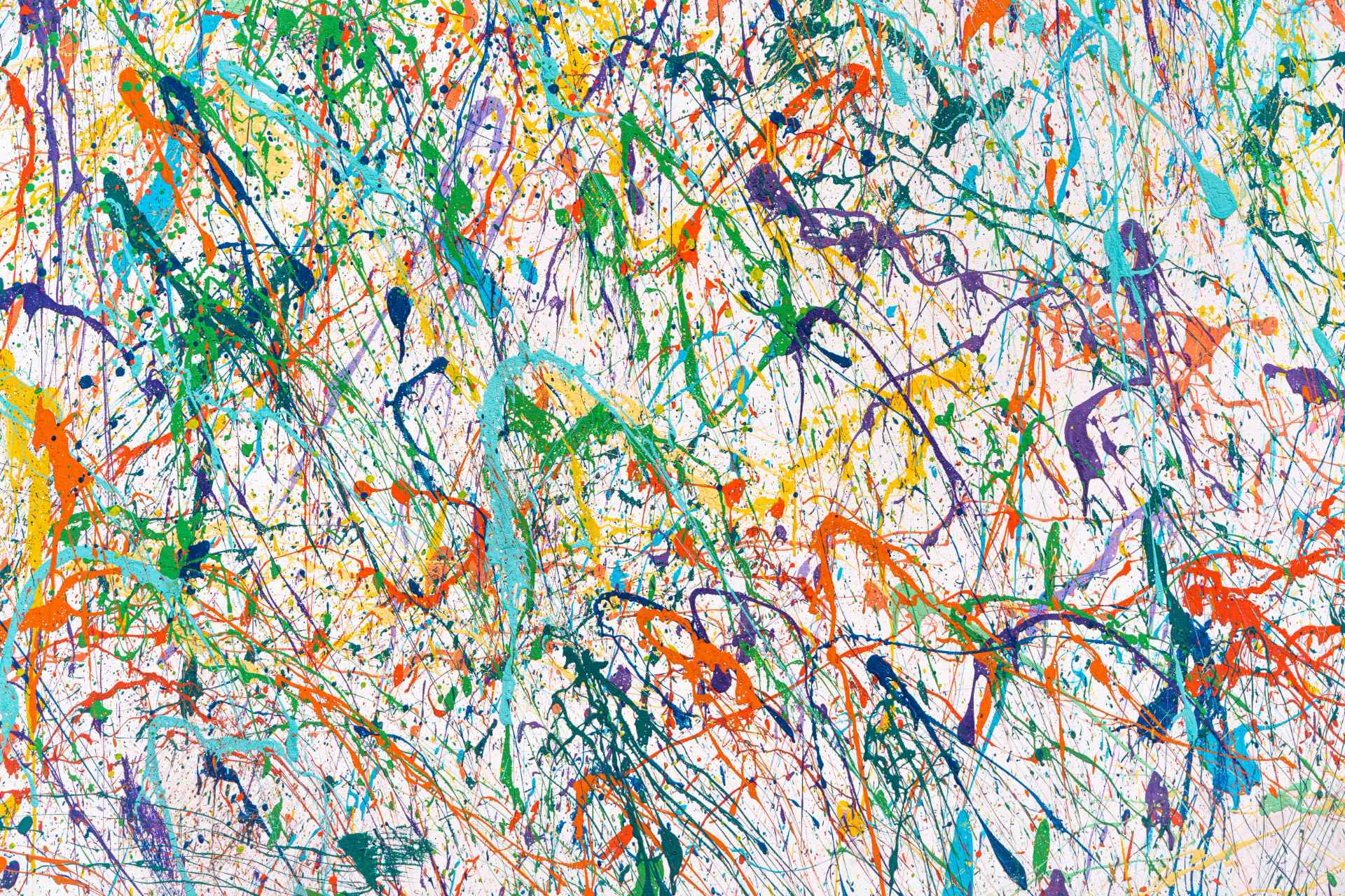
The most direct modern ancestor of maximalism is Abstract Expressionism, a mid-20th century movement prioritising emotion, spontaneity, and the physical act of making. Jackson Pollock’s 1952 painting Convergence shows a thick web of dripped and flung paint. According to the Museum of Modern Art (n.d.), the movement rejected traditional composition in favour of gestural density. Designers still reference Pollock when stacking layers, textures, and hand-drawn marks in modern layouts.
Postmodern design and the Memphis Group
The leap from gallery to brand design happened during the 1980s. Postmodern designers imported expressionist density into commercial work. Ettore Sottsass founded the Memphis Group in Milan in 1981, mixing bright colours, geometric shapes, and clashing patterns across furniture and graphic design. Paula Scher’s early CBS Records covers and April Greiman’s layered digital collages brought similar density to print and screen. Y2K web design, zine culture, and album art kept the visual language alive. Today’s maximalist branding descends directly from these movements.
Why is maximalism trending in 2026?
Maximalism trends upward in 2026 because audience behaviour, platform economics, and generational taste align. Data supports the shift across four dimensions.
- Gen Z reject minimalism at the brand level. A 2025 survey found 48% of Gen Z prefer bold design styles. Another 38% actively embrace bold colour and eclectic combinations in brands they follow (Accio, 2025). Brand preference among audiences aged 18 to 27 now favours density over restraint.
- Colour lifts recognition by up to 80%. Research originating at Loyola University Maryland on visual processing showed colour improved recognition of information by up to 80% over monochrome equivalents (Hoadley, 1990, as cited in Colorcom, n.d.). Applying colour density, a maximalist hallmark, compounds the recognition advantage.
- Pantone signalled the cultural shift. Pantone named Mocha Mousse the 2025 Colour of the Year. Coverage from Dezeen (2024) flagged a parallel shift. Designers pair warm neutrals with saturated accent palettes rather than stripping palettes down to single tones.
- Attention scarcity punishes sameness. Microsoft Canada (2015) reported digital consumers process content in faster bursts than a decade earlier. Bursts reward differentiation. Dense, visually distinct work earns stopping power minimal work rarely achieves in a saturated feed.
The psychology behind maximalist design effectiveness
Maximalism works on three tested psychological mechanisms. Designers applying the style without knowing these mechanisms produce cluttered work. Designers using the mechanisms deliberately produce memorable brand systems.
Visual differentiation drives attention
Eye-tracking research on advertising attention shows visual distinctiveness predicts fixation more than aesthetic quality does. When a stimulus differs from surrounding context, viewers fixate on the stimulus longer and recall brand cues more accurately. In a social feed dominated by white-space minimalism, a maximalist ad becomes the distinct stimulus. Stopping power rises as a direct result.
Information density supports recall
Maximalist design delivers more brand cues per impression. Colour, pattern, typeface, texture, and illustration each carry recognition weight. Meggs and Purvis (2016) note Victorian posters operated on the same principle, packing visual identifiers into single impressions because audiences rarely returned to the poster twice. Modern feeds operate the same way. Users scroll past each impression once. Density compounds recall under these conditions.
Colour recognition compounds brand memory
Colour research links consistent colour use to 80% higher recognition rates (Hoadley, 1990, as cited in Colorcom, n.d.). Maximalist systems use not one colour but a signature conflict pairing. Two clashing colours, held consistently, produce a stronger recognition signal than any single colour deployed alone.
Maximalism vs. minimalism, a structural comparison
Minimalism and maximalism are not opposites of quality. The two styles oppose each other on approach. Both styles produce excellent commercial work when applied with discipline. The question for any brand asks which approach fits audience, category, and positioning.
What are the 5 core principles of maximalist design?
Every maximalist system performing well, rather than looking busy, follows five rules. At Tiron Agency we audit every project against these five principles before shipping work.
- Hierarchy first, decoration second. Decide reading order 1, 2, 3 before adding texture or pattern. If hierarchy breaks, the design has failed regardless of how beautiful the layers are. Design theory refers to this order as visual priority, and maximalism fails without a strict priority chain.
- A signature colour pairing. Pick two colours clashing on purpose, the conflict pair, then build the rest of the palette around them. This approach is the fastest path to recognition in a social scroll. Electric blue with acid orange, magenta with deep green, and oxblood with cream are examples of high-contrast pairings used by current maximalist brands.
- Type as image. Treat typography as a graphic element, not a label. Mix at least two type families. One working combination pairs a high-contrast serif with a neo-grotesque sans-serif. Let size, weight, and position do the communication. Meggs and Purvis (2016) trace the origins of type-as-image back to Victorian playbill design.
- Layered depth. Use overlap, shadow, grain, or halftone to create foreground, midground, and background. Flat maximalism reads as stock photography. Depth creates the physical sensation of density viewers associate with maximalist work.
- Repeatable motifs. Define 3 to 5 recurring graphic motifs. A pattern, an illustration style, a photo treatment. These elements appear across every touchpoint. Recurrence turns busy into a system and gives audiences familiar visual anchors across the brand.
How maximalism helps brands stand out commercially
The strongest argument for maximalism is commercial, not aesthetic. Categories get more crowded every year, and category conventions trend toward sameness. Tell any two DTC wellness brands from 2018 to 2023 apart and the difficulty becomes clear. Maximalism solves the resulting sea of sameness problem through four commercial levers.
- Stopping power in social feeds. In social feeds, the first 0.5 seconds decide whether a user scrolls past. Dense, contrasty, layered work statistically outperforms flat design on thumb-stop rate across brand A/B tests we have run over the past 24 months.
- Higher recall density per impression. Maximalist designs convey more brand information per impression. Elements like color, pattern, and typography each contribute to brand identity, enhancing recall. This is particularly beneficial when media budgets are limited.
- Ownership of category codes. A brand committing to a maximalist system owns an aesthetic. Liquid Death owns skull-driven beverage design. Oatly owns handwritten, flat maximalism on packaging. Aesop owns apothecary minimalism, the same commitment principle reversed.
- Cultural fluency with digital-native audiences. Maximalism reads as of the internet. Brands looking algorithm-native win trust with audiences who grew up on Tumblr, Pinterest boards, and TikTok collage. Gen Z design preferences support this pattern (Accio, 2025).
If you are weighing a rebrand, our branding services team starts every engagement with a differentiation audit. The audit puts your current identity side-by-side against the top 10 competitors in your feed. Nine out of ten times, the single fastest opportunity is more visual density, not less.
What is controlled chaos and why does controlled chaos work?
Controlled chaos is the part of maximalism most brands get wrong. The chaos is cosmetic. The control is structural. Underneath the visible noise sits a strict grid, a fixed palette, repeatable motifs, and a hierarchy of headlines, body, and supporting type.
Chaos lives at the surface. Order lives at the structural layer. Remove the structural layer and the design collapses into clutter. Keep the structural layer and visual density serves communication rather than competes with communication.
Maximalism is harder than minimalism, not easier. Minimalism forgives restraint. Maximalism punishes any decorative element not earning placement through hierarchy or motif consistency.
48%
80%
38%
3–5
How to apply maximalism to your brand in 5 steps
If you want to test maximalism without tearing up your brand, start here. Each step compounds. Resist the temptation to skip to step 5.
- Audit your category. Screenshot the home pages and top social posts of your 10 closest competitors. Note the colours, type choices, and photo treatments they share. Your maximalist opportunity is whatever is missing from the wall.
- Lock a conflict palette. Pick two anchor colours disagreeing visually. Electric blue and bright orange. Acid green and magenta. Oxblood and cream. These become your recognition colours. Add one neutral and one accent to complete the palette.
- Commission custom type. Off-the-shelf Google Fonts are the enemy of brand ownership. Licensing one distinctive display face for headlines will change the temperature of the system by 80%.
- Build a motif library. Design 3 to 5 recurring graphic elements. A pattern, a sticker set, a photo grain, an illustration style. These elements appear across your website, social, and packaging. Motifs are what make the system legible across touchpoints.
- Stress-test at small sizes. Maximalist systems fail most often in mobile ads, favicons, and app icons. If your system holds up at 32 pixels, the system holds up anywhere. Run design QA at favicon scale before signing off on any maximalist identity.
Common pitfalls of maximalist design
- Clutter mistaken for density. Adding elements without removing any produces indecision, not maximalism. Every layer must earn placement against hierarchy and readability.
- Too many typefaces. Mixing type is fine. Mixing six typefaces is not. Stick to two or three families and vary size, weight, and case instead.
- Ignoring accessibility. Saturated-on-saturated colour pairings often fail WCAG 2.2 contrast minimums. Run every colour pair through the WebAIM (2024) contrast checker and keep body copy at 4.5:1 minimum. Accessibility is non-negotiable for any brand serving public audiences.
- No restraint at scale. A maximalist hero works. A maximalist checkout flow does not. Use density where attention matters. Pull back where conversion matters.
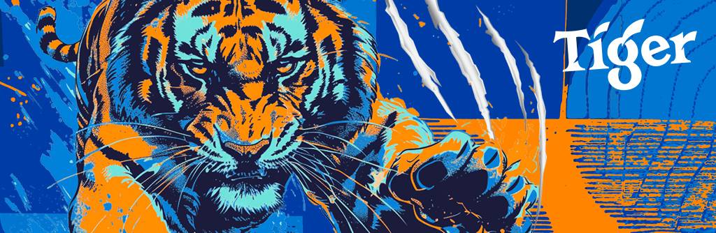
Tiger Wall Art proposal
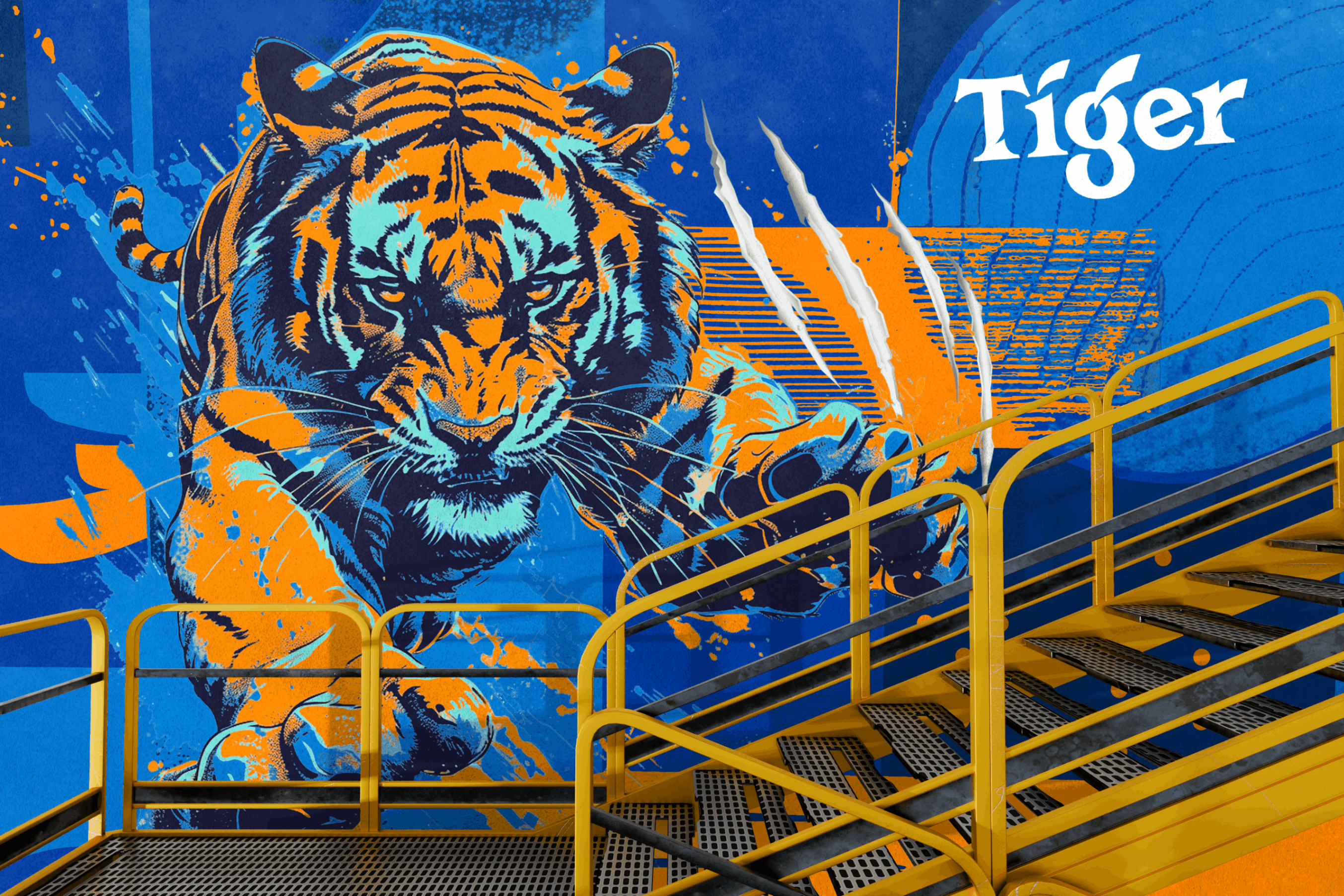
For the Tiger wall, we started with a tight system before introducing any expression. A three-colour palette electric blue, vivid orange, and high-contrast white anchored everything. Beyond that, the illustration style, halftone textures, and graphic overlays all had to operate within a single visual language.
The outcome feels explosive, but it’s built on discipline. The system itself is intentionally rigid and unremarkable. That restraint is what allows the surface to feel alive layered, aggressive, and full of motion. When the rules stay quiet, the visuals can be loud. If the system competes for attention, the energy collapses.
What looks like chaos is actually controlled. A handful of fixed decisions created the freedom for everything else to hit harder. Artwork done by Marcella Niebres
Frequently Asked Questions
Is maximalism the same as brat or Y2K design?
No. Brat and Y2K are subgenres of maximalism with specific visual cues (neon, chrome, glitch, early-2000s web graphics). Maximalism is the broader principle of embracing visual density. Y2K is one way to express the principle.
Is maximalism only for youth-facing brands?
No. Financial, legal, and B2B brands use maximalist principles through layered typography and editorial density without relying on neon colour. Bloomberg Businessweek and The Economist have used maximalist cover design for decades.
How long does a maximalist rebrand take?
A full identity system with custom type, motif library, and guidelines typically takes 8 to 12 weeks. A lighter refresh adding a maximalist layer on top of an existing wordmark ships in 3 to 4 weeks.
Is minimalism dead?
No. Minimalism remains the right answer for many categories, especially premium and regulated ones. The shift in 2026 is different. Minimalism is no longer the default. Minimalism is now a deliberate choice, same as maximalism.
References
Accio. (2025). Gen Z maximalism trend: How 2025 fashion breaks minimalist rules. https://www.accio.com/business/gen_z_maximalism_trend
Colorcom. (n.d.). Why color matters. https://www.colorcom.com/research/why-color-matters
Dezeen. (2024, December 5). "Unpretentious" Mocha Mousse named Pantone’s colour of the year 2025. https://www.dezeen.com/2024/12/05/mocha-mousse-pantone-colour-of-the-year-2025/
Meggs, P. B., & Purvis, A. W. (2016). Meggs’ history of graphic design (6th ed.). Wiley.
Microsoft Canada. (2015). Attention spans: Consumer insights. https://dl.motamem.org/microsoft-attention-spans-research-report.pdf
Museum of Modern Art. (n.d.). Abstract expressionism. https://www.moma.org/collection/terms/abstract-expressionism
WebAIM. (2024). Contrast checker. https://webaim.org/resources/contrastchecker/
Maximalism is not about breaking rules.
Maximalism is about knowing which rules to break and building a tight enough system for the chaos to serve a commercial outcome. In 2026, with feeds more saturated and attention scarcer than any previous year, a deliberately maximalist brand is often the brand audiences remember.
If you are exploring whether maximalism fits your brand, book a differentiation call with Tiron Agency. We will audit your category in under 30 minutes and report honestly where your opportunity sits.
About Me