.avif)
About the project
Cut Through the Noise
In a region saturated with recruitment firms, XPAT Today needed a brand that would stand out fast. They were looking for a sharp identity that could reflect their human-first approach while staying bold, confident, and recognisable in a highly saturated market. A strong logo was key to breaking through the clutter and building credibility in a space where trust and speed matter most.
Designed to Connect
We created a full brand identity and website that reflects the company’s direct and people-focused ethos. At the heart of the design is a mark that cleverly forms an X, a T, and a person all at once. It’s clean, memorable, and meaningful. The brand’s embodiment is clear, quick to digest, and avoids fluff where talent acquisition is geared for efficiency. Every element was built for function, recognition, and real human connection.
.png)
Made to Stand Out
The XPAT Today logo tells a subtle story where a bold X and T merge to form a human figure, a nod to the brand’s people-first mission. This visual anchor extended across the entire identity, creating a cohesive brand experience. The website followed suit: clean, minimal, and built for speed. With high-contrast colours like yellow, white, and black, and a clear-cut layout, the interface makes finding talent feel seamless and immediate, just like the company itself.
.avif)
.avif)
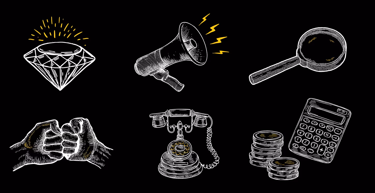
Icons That Speak Their Language
To break away from the recruitment industry’s sea of stock imagery, we created a custom set of sketch-style icons. These illustrations not only replaced generic visuals but became a signature style across the website and social media. Each icon feels personal and handpicked, much like XPAT Today’s approach to recruitment. The result is a visual embodiment of clarity and distinction to a brand built on human connection.
Next project
No next Project !

.avif)
.avif)
.avif)
.avif)