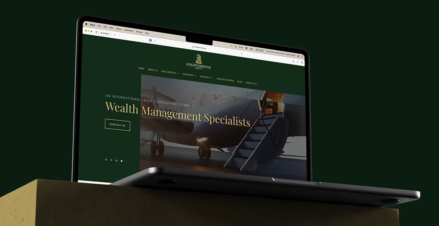
READY MADE BEVERAGE BRAND
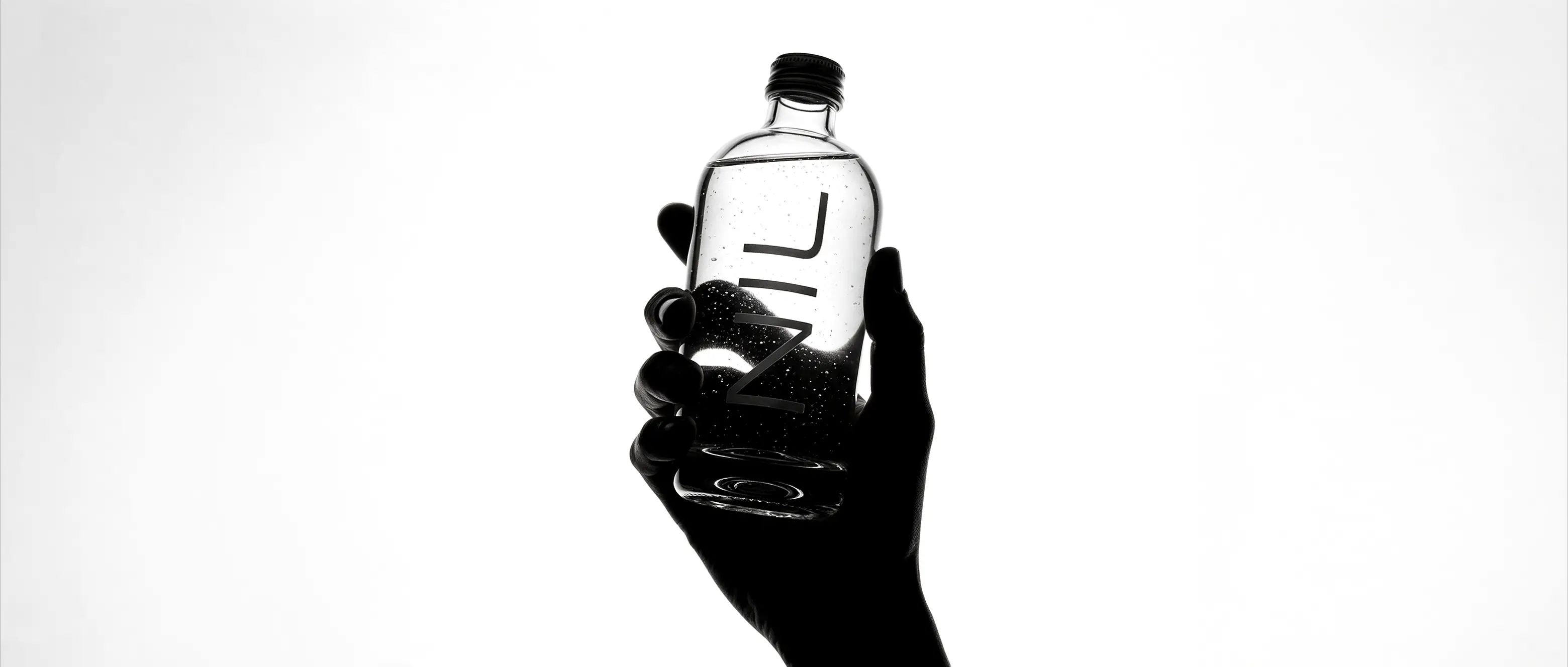
A Different Take on Zero
Zero sugar drinks do not need to look like a compromise. Wecreated NIL around a simple idea: strip away the noise and let the productspeak for itself. Designed for a modern, design conscious audience, the conceptbrings together clean aesthetics, understated confidence, and a distinctivepoint of view. It turns the absence of sugar into the foundation of a brandthat feels considered, contemporary, and unapologetically minimal.
Less, By Design
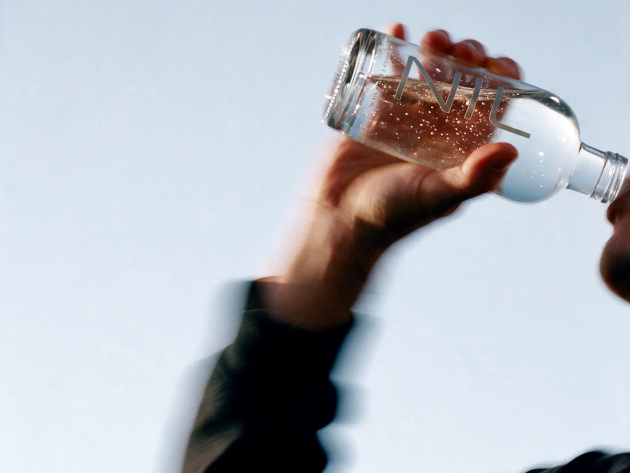
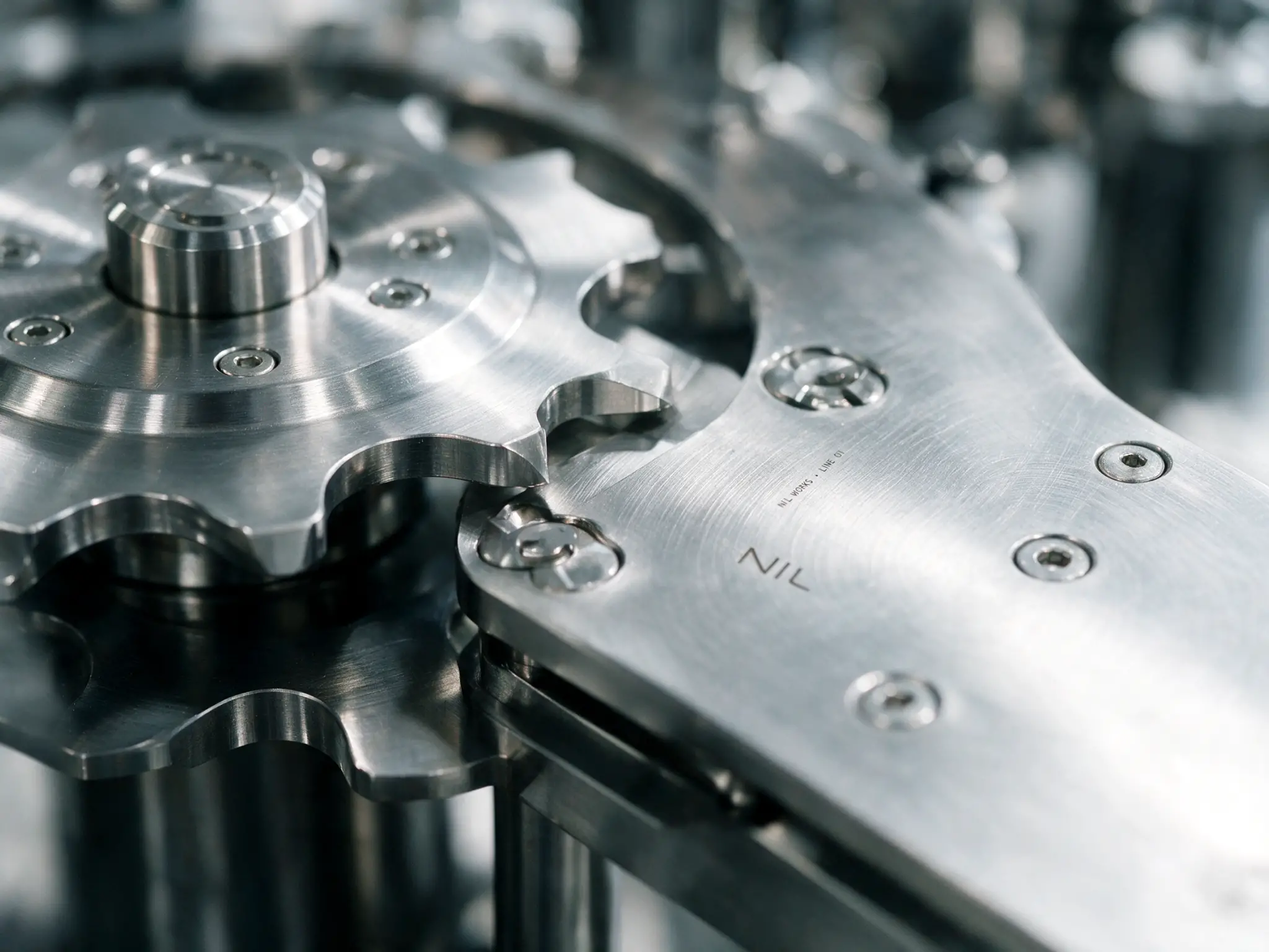
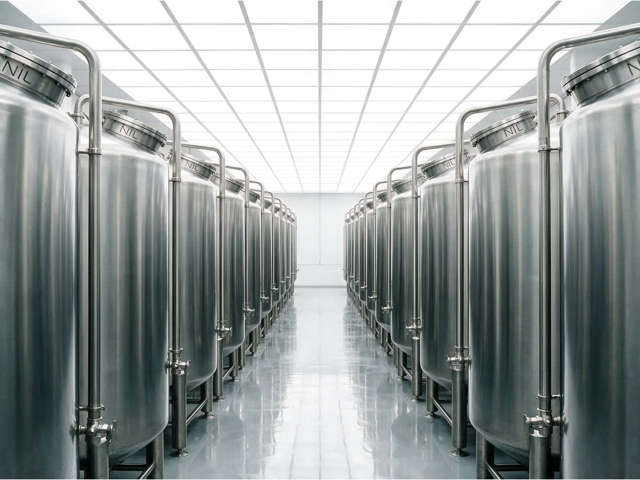
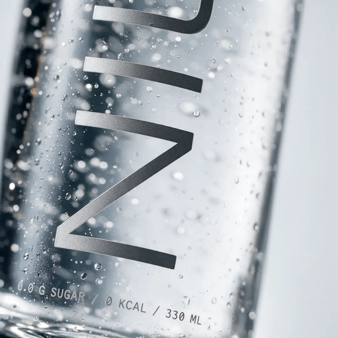
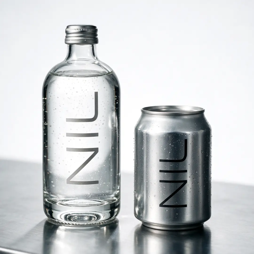
We built NIL around clarity, from the glass bottle anddirect to glass typography to the restrained colour palette and precisedetailing. Every decision supports the same idea, with no unnecessary labels oroversized claims competing for attention. The result is a cohesive brand systemthat carries through packaging, campaign visuals, and digital touchpoints,giving the concept a recognisable identity and a strong foundation for futuregrowth.
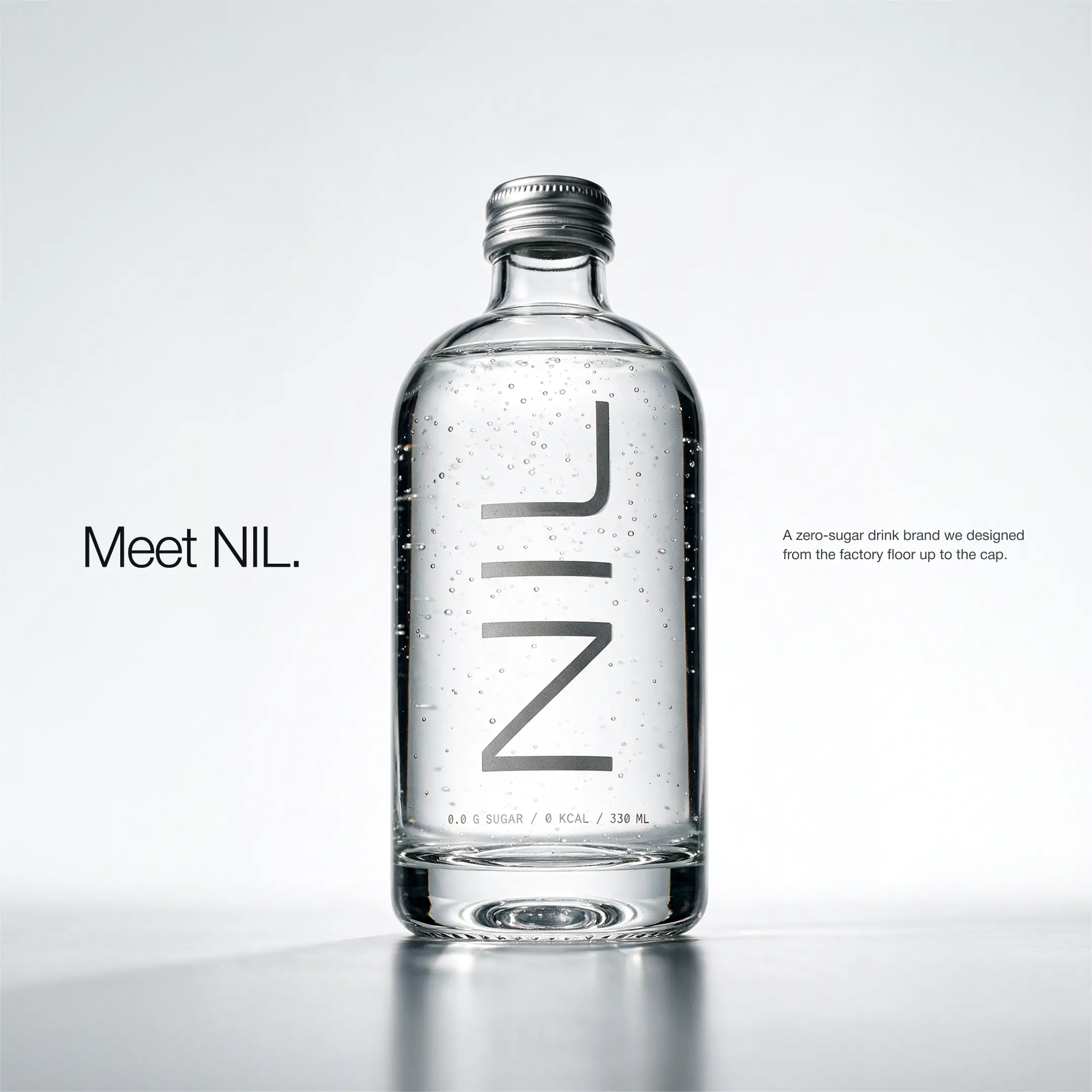
A Bottle That Speaks for Itself
A crowded drinks market often relies on loud colours andlouder claims to get noticed. NIL takes the opposite route, using clear glass,direct to bottle typography, and carefully controlled details to make thepackaging the statement. The result is a distinctive shelf presence built onrestraint, giving the concept a premium feel without adding unnecessary visualnoise.
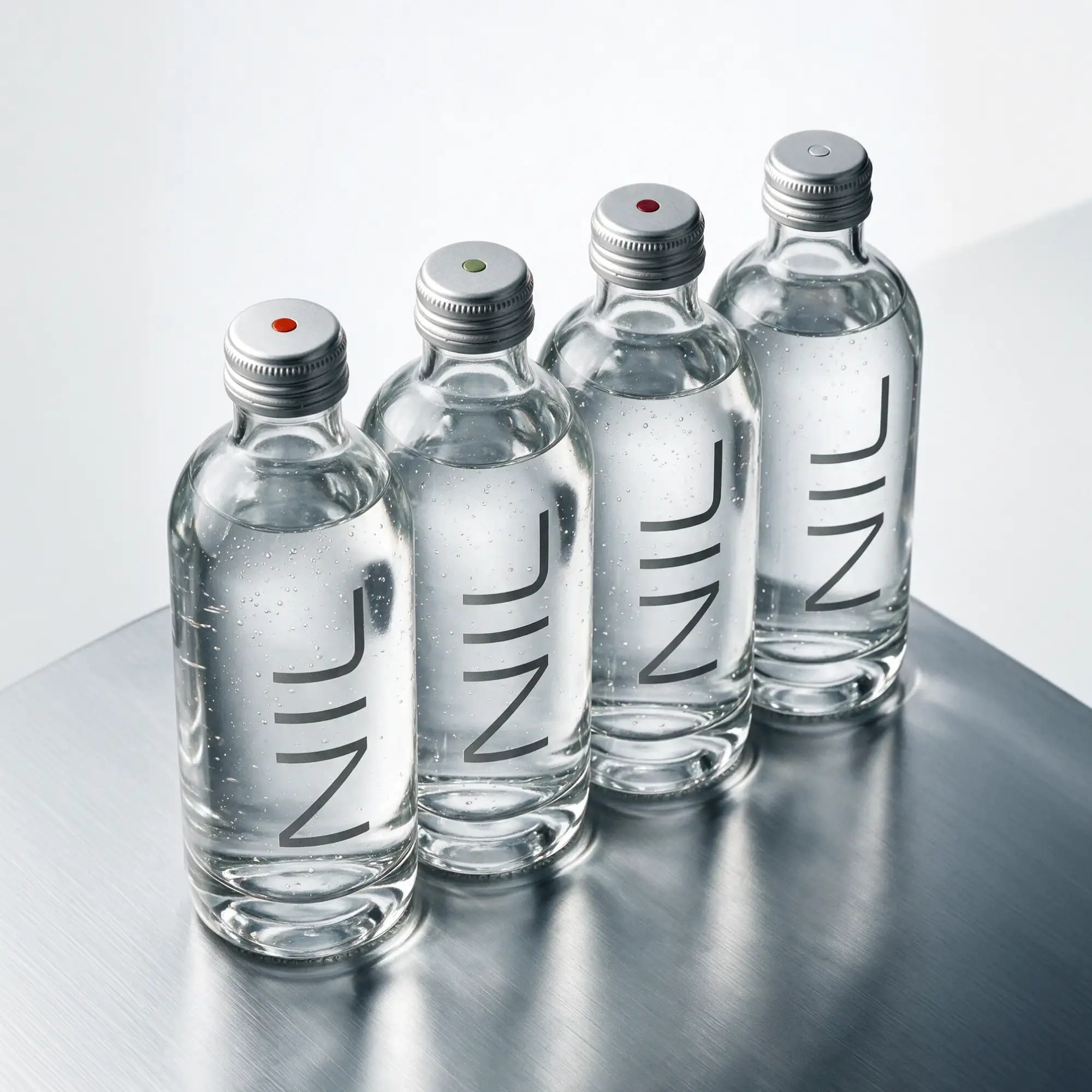
Built to Move Beyond the Bottle
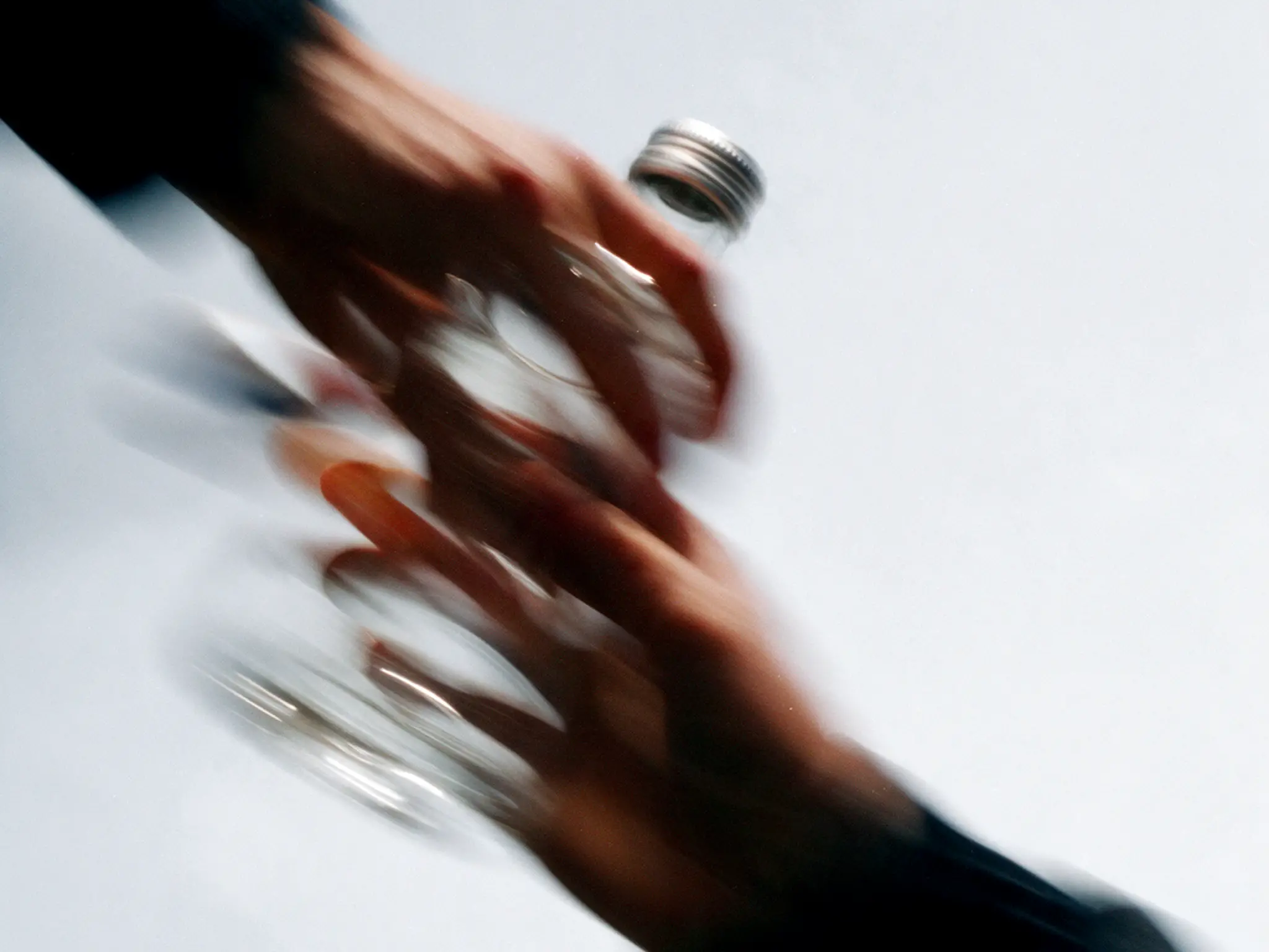
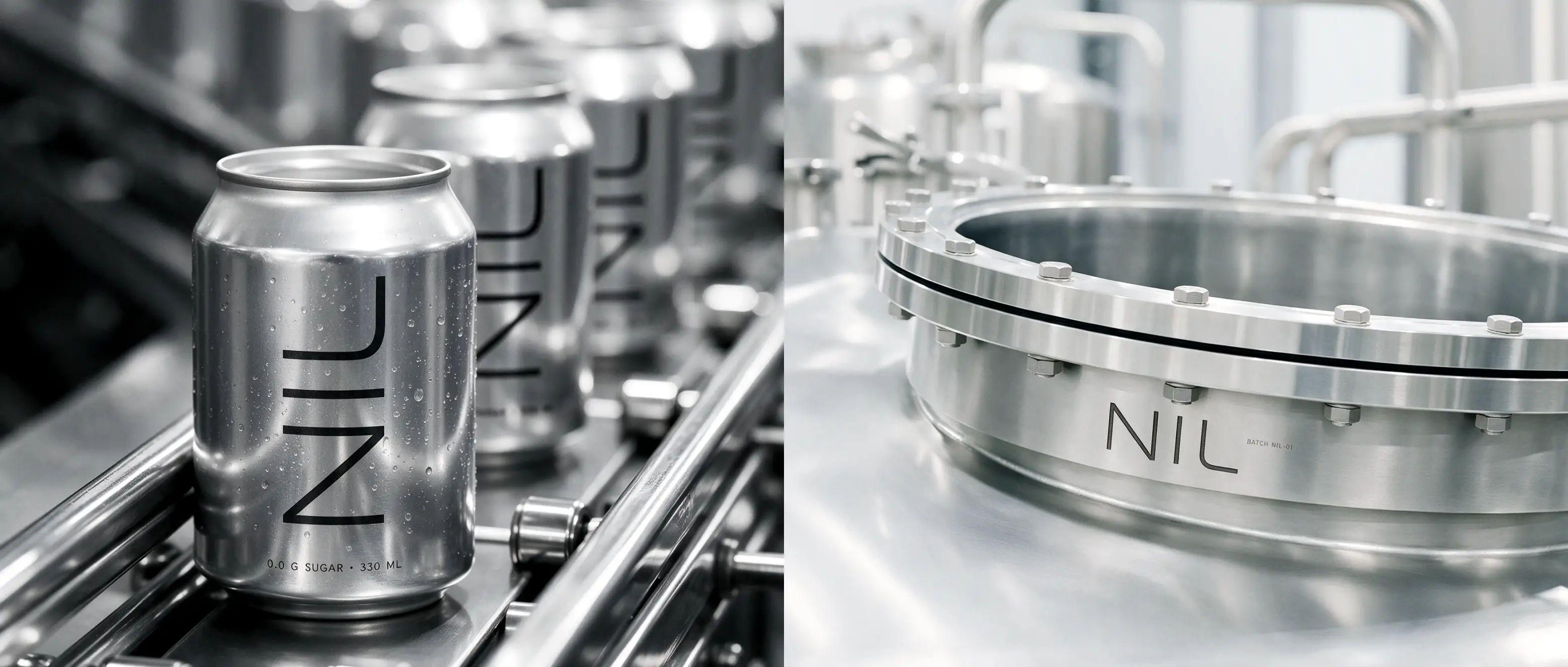
A brand needs to feel consistent wherever people encounterit. NIL's visual system extends from the bottle to campaign imagery and digitallayouts, creating a clear connection across every touchpoint. Its flexibledesign language leaves room for new editions, product extensions, and futurecampaigns while maintaining the same unmistakable character across desktop andmobile experiences.
Next project
No next Project !